> For the complete documentation index, see [llms.txt](https://docs.enlyze.com/llms.txt). Markdown versions of documentation pages are available by appending `.md` to page URLs; this page is available as [Markdown](https://docs.enlyze.com/en/production-optimization/analysis/production-run-analysis.md).
# Production run analysis
Compare machine variables across several production runs and time ranges, as time series, distribution, correlation, statistics or run comparison.
Production run analysis overlays several production runs from the same machine so you can see where they differ. The typical question: one run went well, the next went badly, and you want to know which process parameter changed.
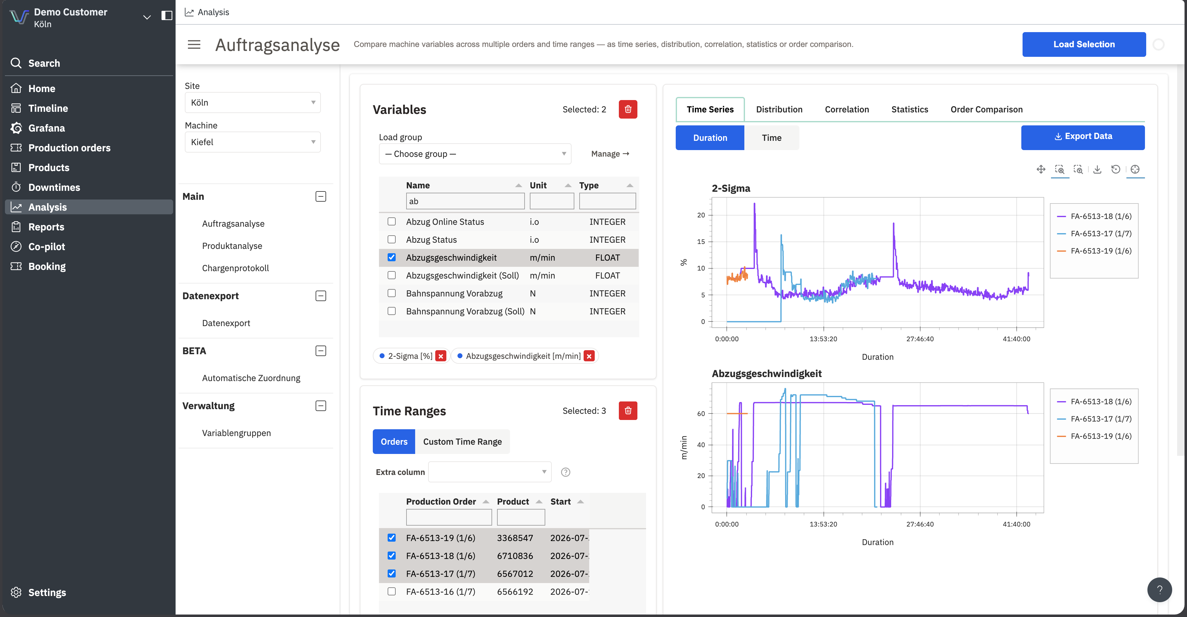
Two variables across three production runs, overlaid as time series
## Prerequisites
* A machine with active variables
* Production runs booked on that machine
## How it works
{% stepper %}
{% step %}
## Select site and machine
In the sidebar. Every list below refers to this machine.
{% endstep %}
{% step %}
## Select variables
Under **Variables**, tick the variables you want to compare. The table shows **Name**, **Unit** and **Type**; the filter fields under the column headers help in long lists.
Selected variables appear as chips below the table. **Load group** pulls in a saved selection from [Variable groups](/en/production-optimization/analysis/variable-groups.md).
{% endstep %}
{% step %}
## Set the time ranges
Under **Time Ranges**, choose between two modes:
* **Orders**: tick production runs in the table. Each run becomes one comparison range.
* **Custom Time Range**: enter start and end freely, independent of runs.
**Additional column** adds an extra run column, useful for filtering on an attribute that isn't shown by default.
{% endstep %}
{% step %}
## Load the selection
Select **Load Selection** at the top right. Nothing is fetched until you do.
{% endstep %}
{% endstepper %}
## The five views
Five tabs sit over the same selection.
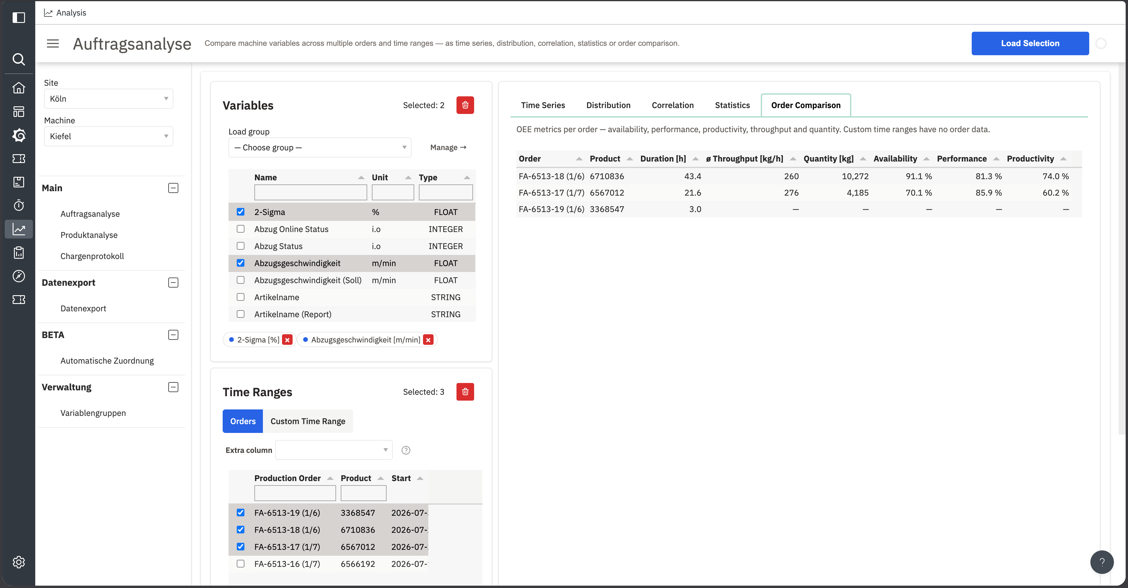
The Order Comparison tab puts the selected runs' metrics side by side
| Tab | What you see |
| -------------------- | -------------------------------------------------------------------------------------------------------------------------------------- |
| **Time Series** | One plot per variable, one line per range, all normalised to a shared duration so runs of different lengths line up. |
| **Distribution** | One boxplot per variable, one box per range. Spread rather than progression. |
| **Correlation** | Scatter plot of two variables against each other, points coloured per range. Pick the two variables from the dropdowns above the plot. |
| **Statistics** | Mean per numeric variable and range, plus the percentage difference between them. |
| **Order Comparison** | Metrics per run: duration, average throughput, quantity, availability, performance and productivity. |
**Order Comparison** stays empty in **Custom Time Range** mode. Metrics need a run to attach to.
## Statistics cover production time only
One difference that catches people out:
{% hint style="warning" %}
**Statistics**, **Distribution** and **Correlation** cover actual production time only. Samples inside detected downtimes are excluded. **Time Series** and the CSV export show the raw data, downtimes included.
The same throughput can therefore have a higher mean under **Statistics** than the plot under **Time Series** suggests. That is deliberate: a mean that counts downtime zeros does not describe how the machine performed.
{% endhint %}
The logic matches how availability is calculated for OEE. See [Availability](/en/concepts/understanding-oee/availability.md).
## Exporting data
Below the plots is a CSV download for the loaded selection. The export contains raw data, so downtime periods are included. For larger or recurring exports, use [Data export](/en/production-optimization/analysis/data-export.md).
## Common questions
Can I compare variables from several machines?
No. One analysis covers exactly one machine. To compare across machines, export the metrics via [Data export](/en/production-optimization/analysis/data-export.md) and combine them elsewhere, for example in Power BI or Grafana.
Why are the plots empty when runs are selected?
Check three things: is at least one variable ticked, did you select **Load Selection**, and does the variable return values in that range at all. Variables of type `STRING` do not appear in numeric views.
What does normalising to a shared duration mean?
The x-axis under **Time Series** defaults to **Duration**: a four-hour run and a twenty-hour run both start at zero so their progression can be compared.
Switch the axis to **Time** and normalisation is dropped, showing the runs one after another with their real timestamps.
## Related topics
* [Product analysis](/en/production-optimization/analysis/product-analysis.md) answers the same question across every run of a product rather than a hand-picked few.
* [Variable groups](/en/production-optimization/analysis/variable-groups.md) if you need the same variable selection regularly.