> For the complete documentation index, see [llms.txt](https://docs.enlyze.com/llms.txt). Markdown versions of documentation pages are available by appending `.md` to page URLs; this page is available as [Markdown](https://docs.enlyze.com/en/production-optimization/data-quality/overlapping-production-runs.md).
# Analyze overlapping production runs
See which production runs overlap in time on a machine.
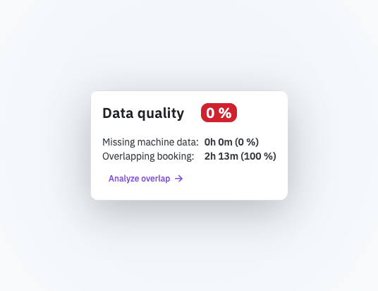
When the [data quality card](/en/production-optimization/data-quality.md) reports an **overlapping booking**, several production runs claim the same period on the same machine. The overlap analysis shows you which runs these are and how their time periods relate, so you can find the cause in your production planning or ERP system.
The analysis is read-only. It does not change or resolve overlaps. The correction happens where the production runs are booked (see [Booking production runs](/en/connect/it-connectivity/booking-app.md)).
## Open the analysis
1. Open the **production run details** of a run with an overlapping booking.
2. In the data quality card, click **Analyze overlap →**.
Click Analyze overlap to open the analysis
The analysis opens as a side panel. The production run you started the analysis from is the **origin run**.
{% hint style="info" %}
The **Analyze overlap** link only appears when the production run actually has an overlap.
{% endhint %}
The overlap analysis with table and chart
## The overlap table
The table lists the origin run and all production runs on the same machine whose time period overlaps with the origin run's. It contains the following columns:
| Column | Meaning |
| -------------------- | -------------------------------------------------------------------------- |
| **Machine** | The machine the production runs belong to. |
| **Production order** | The production order code. The origin run is marked as the **origin run**. |
| **Product** | The manufactured product (code and name). |
| **Runtime** | The duration of the production run. |
| **Time period** | The start and end time of the production run. |
| **Status** | **completed** or **ongoing** (for runs that are still active). |
The origin run is highlighted with a green background so you always know which run you started from. The icon at the end of a row opens the overlap analysis for another run in a new tab.
## The overlap chart
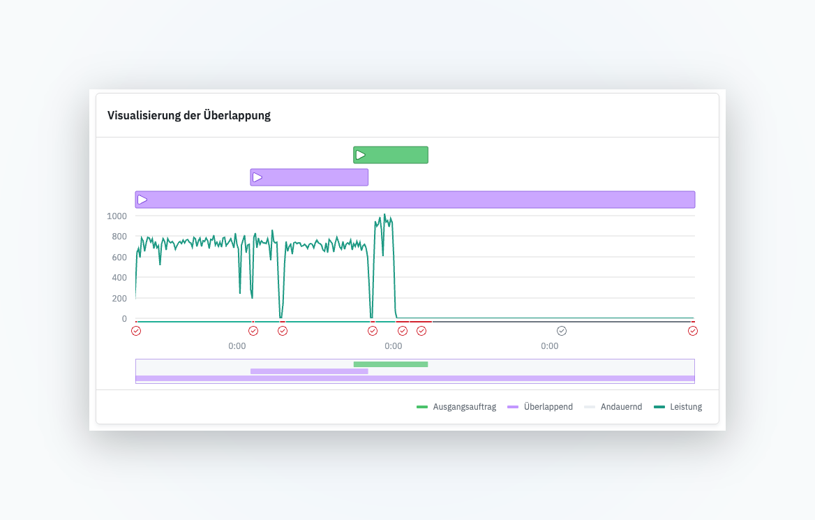
Below the table, a chart shows all production runs as horizontal bars on a shared time axis (one bar per run). This lets you see at a glance how the time periods overlap. The chart also shows the machine's throughput data and detected downtimes over the same period.
The colors follow a fixed logic:
* **Green**: the origin run.
* **Gray**: ongoing runs.
* **Purple**: other completed runs.
So that even very short runs stay visible and clickable, every bar has a minimum width. When a run extends beyond the visible range, a double chevron (`«` or `»`) at the edge indicates that the bar continues.
When you hover over a bar in the chart, the matching row in the table is highlighted. This works the other way around too: hovering over a table row highlights the matching bar.
## Zoom the time axis
Production runs can be hours, but also months apart. So you can still examine the overlap in detail, the chart offers several ways to adjust the visible time period:
* **Overview bar**: Use the bar below the chart to zoom and pan the visible range continuously.
* **Drag to zoom**: Draw a rectangle directly on the chart to quickly zoom into a region.
* **Reset zoom**: Resets the view to the full time period, with all production runs visible.
## Fix an overlap
The analysis helps you recognize the pattern behind an overlap, for example two production runs with overlapping timestamps or an unfinished, ongoing run. You make the actual correction at the source of the production run booking:
* Check the start and end times of the production runs involved in your planning or ERP system.
* End production runs that are incorrectly marked as ongoing.
* Correct the booking and synchronize the production runs to ENLYZE again.
Once the time periods no longer overlap, the data quality of the production run rises and the affected metrics are calculated again.
## Related pages
* [Data quality](/en/production-optimization/data-quality.md): How data quality is composed and why it matters.
* [Production order](/en/resources/production-context/production-runs.md): How production runs are defined in ENLYZE and stay unique.
* [Booking production runs](/en/connect/it-connectivity/booking-app.md): How production runs are booked into ENLYZE.